# load libraries
library(ggplot2)
library(dplyr)
library(showtext)

# set default theme
theme_set(theme_minimal())

# set url
.repoURL <- paste('https://raw.githubusercontent.com',
                  'rfordatascience',
                  'tidytuesday',
                  'master',
                  'data',
                  '2023',
                  '2023-02-07',
                  sep = "/")

# download data
dt_prices <- readr::read_csv(paste(.repoURL, 'big_tech_stock_prices.csv', sep = "/"))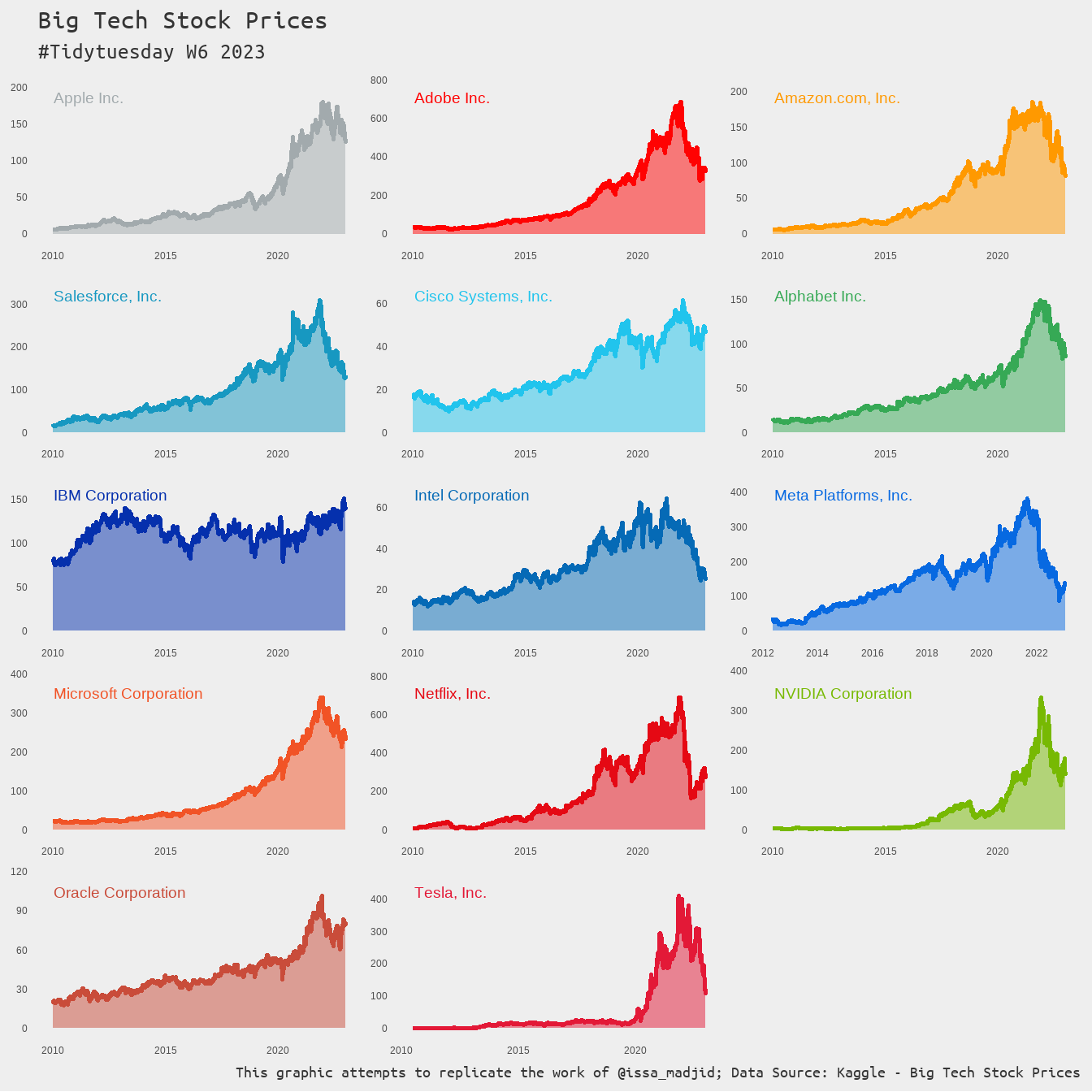
dt_info <- readr::read_csv(paste(.repoURL, 'big_tech_companies.csv', sep = "/"))This is the Week 6 of 2023, and the topic for the week is the stock prices of big tech companies in the US. The dataset can be accessed from kaggle. This contains a list of prices for 14 companies between 4 January 2010 and 29 December 2022. For the week I attempted to replicate the work of Abdoul Madjid and learned how to use custom fonts for the graph.
Environment setup
For this work, I loaded three essential libraries: ggplot2 for data visualisation, dplyr for manipulating data, and showtext for using fonts from Google Fonts.
Customizing fonts for ggplot2
Working with different fonts is something that I always wanted whenever I created a visualisation using ggplot2. I dedicated this project for myself practicing on not using the default fonts provided by the ggplot2 and R ecosystem. After researching on the internet, I found a simple way to have more control over the fonts in a plot using the library showtext. This is particularly easy as the package gives its users to work with TrueType fonts (through the use of .ttf file) and web fonts (such as by using font_add_google function).
For this work, I only use the font Ubuntu mono which is available on Google Fonts. In the R system, this font will be referenced as ubuntu_mono.
font_add_google("Ubuntu mono", "ubuntu_mono")

showtext_auto()
Data preparation
For the visualisation, I replaced the logo of the firms with the their names. I also shortened the IBM company name so that it fit nicely in the graph later.
dt_info <- dt_info |>
  left_join(summarise(dt_prices,
                      y_coor = max(adj_close) * 1.15,
                      x_coor = min(date) + 15,
                      .by = stock_symbol),
            by = "stock_symbol") |>
  mutate(company = stringr::str_replace(company,
                                        "International Business Machines",
                                        "IBM"))
In addition, I used the most dominant colours of each company’s brand for the plot.
colour_palette <- c(
  "AAPL"  = "#A2AAAD",
  "ADBE"  = "#FF0202",
  "AMZN"  = "#FF9900",
  "CRM"   = "#1798C1",
  "CSCO"  = "#21C4ED",
  "GOOGL" = "#36A955",
  "IBM"   = "#0530AD",
  "INTC"  = "#056AB6",
  "META"  = "#0769E1",
  "MSFT"  = "#F15326",
  "NFLX"  = "#E50914",
  "NVDA"  = "#77B903",
  "ORCL"  = "#C94C3A",
  "TSLA"  = "#E31937"
)
Visualisation
The plot that I intended to replicate is relatively straightforward. It uses a combination of geom_area and geom_line as the main graphical elements, added with facet-ing by companies.
dt_prices |>
  ggplot(aes(x = date,
             y = adj_close,
             colour = stock_symbol,
             fill = stock_symbol)) +
  geom_area(alpha = .5) +
  geom_line(linewidth = 1) +
  geom_text(data = dt_info, aes(x = x_coor, y = y_coor, label = company),
            vjust = 2, hjust = 0, size = 5) +
  facet_wrap(. ~ stock_symbol, ncol = 3, scale = "free") +
  scale_colour_manual(values = colour_palette, guide = "none") +
  scale_fill_manual(values = colour_palette, guide = "none") +
  labs(title = "Big Tech Stock Prices",
       subtitle = "#Tidytuesday W6 2023",
       caption = paste("This graphic attempts to replicate the work of @issa_madjid",
                       "Data Source: Kaggle - Big Tech Stock Prices", sep = "; "),
       x = NULL,
       y = NULL) +
  theme_minimal() +
  theme(
    plot.title = element_text(size = 25, family = "ubuntu_mono", color = "#343434"),
    plot.subtitle = element_text(size = 20, family = "ubuntu_mono", color = "#343434"),
    plot.caption = element_text(size = 15, family = "ubuntu_mono", color = "#343434"),
    plot.background = element_rect(fill = "#eeeeee", colour = NA),
    panel.background = element_rect(fill = "#eeeeee", colour = NA),
    panel.grid = element_blank(),
    strip.text = element_blank()
  )
Wrap up
For the week, #TidyTuesday gave an interesting time-series dataset. This can be analysed and visualised in many different ways. My approach on #TidyTuesday is to leverage this opportunity to practice my coding skill by imitating other works without looking at their code. This week, I could copy the amazing work of Abdoul Madjid and learn how to use my own fonts for the graph.